Challenges
-
The diagnostic tool heavily relies on chart analysis to identify signal spikes.
-
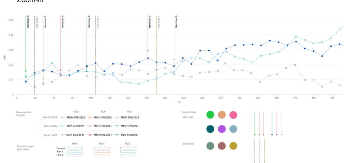
Some charts feature more than 24 lines, with numerous variables represented by legends.
-
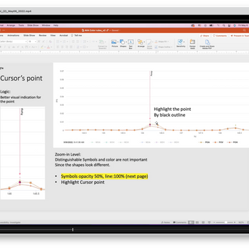
Analysts meticulously zoom in and out of charts to examine data, annotating or marking issues for customer reports.
-
They use different types of charts, including 3D perspective ones, to analyze historical data and conduct time series analysis.
-
Notably, one user's color blindness (Daltonism) prevents differentiation between red and green.


How I enhanced color accessibility in complex charts
using unconventional design tools
2022
Enterprise Solutions
Elevating Accessible Design for Complex Charts in Analytics Tools
Duration: 2022
Goal: Redesign the vibration analysis tool for data analysts in the US based on user research.
My Role: Senior UX Designer
Team: Me, Principal UX Researcher, Product Manager, Engineering Team, Domain Experts
Enterprise Solutions

Overview
Advanced Vibration Diagnostics leverages vibration to listen to equipment and measure the interaction of the rotating components of a piece of equipment in order to detect the slightest changes that can be a warning of developing malfunctions. Using this diagnostic tool, technicians arrive at solutions quickly, which helps customers maintain and avoid unexpected system downtime.
The task involved redesigning the analytics software for vibration analysis. This portfolio showcases the design process, including line and three-dimensional chart design.


Prototype Design
Design wireframes and working mockups to evaluate.

Concept Testing
Evaluate the mockups with users and get feedback to iterate the design

Define Usability Problems
List all the issues and prioritize them with product managers and UX team.

Stakeholder Interviews
Gather requirements and learned domain knowledge with users and product managers.
Design Process
In addressing the issue, my design process involved two parts of teamwork: conducting research to discover the problem and talking with stakeholders and domain experts to gather the requirements. Additionally, I selected an appropriate chart type, carefully chose colors for accessibility to effectively differentiate between the 24 lines present on the chart, conducted concept testing with users, and iterated the design based on their feedback to ensure optimal usability and effectiveness.

Prototype Design
Design wireframes and working mockups to evaluate.

Concept Testing
Evaluate the mockups with users and get feedbacks to iterate the design
Design Experiment with New Tools
Selecting colors for a chart with multiple line graphs presented a challenge. To address this, I grouped hues by component categories such as motor drive end bearing and pump outbound bearing.
Next, I employed an algorithm, k-means clustering, to assist in color selection. I swiftly implemented the chosen colors using R programming to visualize the results. Additionally, I utilized the Illustrator graphic tool to verify the hue and saturation location and space. This process highlights my versatility in utilizing various design tools beyond traditional graphic tools.


Stakeholder Interviews
Gather requirements and learned domain knowledge with users and product managers.

Define Usability Problems
List all the issues and prioritize them with product managers and UX team.


K-mean clustering of HCL
Quickly select colors based on the HCL (Hue-Chroma-Luminance) color space, which represents human perception using three parameters.

R Programming
Generate line and scatter charts to visualize large-scale data, including many legends, for thorough examination.

Illustrator’s color space
Check the selected color space by hue and saturation, aiming to avoid overlap between graph lines and annotation mark lines.
Employing Diverse Graph Types and Accessible Color Rules
Examine the data from multiple perspectives by employing diverse graph types. I crafted a range of graphical representations and established color guidelines based on accessibility considerations. Detail Presentation Link


Outcomes & Insights
Navigating Complexity: A Journey of Iterative Design
The journey of addressing this issue was characterized by a comprehensive and iterative design process that prioritized usability, accessibility, and stakeholder collaboration. I collaborated with the principal UX researcher to facilitate generative research and conducted evaluative research using design mockups that I created.
Designing for User Experience: Prioritizing Usability and Accessibility
Through careful consideration of chart types, color choices, user feedback, and stakeholder input, I was able to devise a solution that effectively addressed the complexity of the data while ensuring optimal user experience and comprehension.


